Residential Projects

SOCIAL FLOW
Architecture is a social pattern. It guides us, gently or strongly, in the way we interact with each other and even with ourselves. A round dining table inspires a different kind of conversation than a long thin one. We design spaces with good social flow, improving rather than interrupting the lives of those who use them. We seek to understand and develop the social pattern desired by the client or context. From this, we generate an architecture that embodies that social pattern. Humans are inherently adaptable: we are all hermit crabs. We can sleep in an airport and cook on a picnic table. However, when the way you want to live is in alignment with the space you inhabit, friction is removed and a beautiful life is possible.

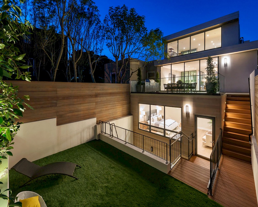
Noe Looking Glass seamlessly opens and closes with massive floor to ceiling doors and walk-out terraces at every level as well as a level yard connected directly to the family room. The outdoors is invited in by extending materials such as the beautiful cedar siding and sophisticated patterned tile through from outside to inside, blurring the boundary between the two. Light suffuses the home at every turn, made possible because the building is fully-detached.

A new ground-up two story home over a basement in the Willow Glen neighborhood of San Jose, designed to fit among the beautiful mature redwood trees on the site. This home is for a young family with three growing and energic sons. We focused on durable yet elegant materials including a stained concrete floor, cement fiber siding at the steel and wood slab staircase and exposed douglass fir beams and columns. The indoor/outdoor flow of the home is exemplified by materials transitioning from in to out and large sliding doors that open the home up the pool and expansive park-like yard.

This home is an astounding transformation of one of the classic Marina-style building found throughout the north side of the city. We sought to create a new interpretation of the simple two story facade with fine white stucco, anodized metal windows and panels and a warm rich oak paneled entry door. Inside, the low tunnel entrance was opened up to a soaring light-filled double-height space. The material palette and detailing are refined and essential: brushed grey oak cabinets, simple steel railings, pinstripe detailing at the doors and baseboards. Everything is carefully considered and unified allowing an expansive sense of space and light flow throughout. A new third floor is set back from the street so as to not disrupt the scale the neighborhood. A fourth floor penthouse captures views of Golden Gate Bridge.

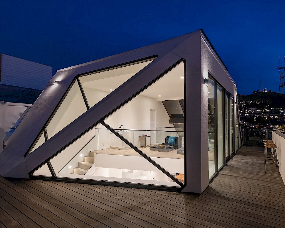
This remodel and addition completely reimagines a 1940s row house at the top of a steep block above Eureka Valley for a young couple from China. Clean lines and crisp blacks and whites gradually open up more and more as you rise through this home with its reverse floorplan. A new folded jewel-like penthouse caps the project, sheltering an airy loft-like living level, with space and light flowing up and over the fourth-floor family room to the third-floor kitchen, living and dining below. Panoramic views of the skyline and twin peaks are captures from every angle, turning the home into a lens. Refined details such as a folded steel plate stair, minimal white cabinets and silky honed marble slabs manifest the overall design concepts at every scale, creating a peaceful sense of place.

Located in a quiet mature neighborhood in the Silicon Valley town of San Mateo, this ground up home imagines a new life for this family, leaving behind their low boxy former house on the site for this new one. The new home stiches together the basement and two levels with dramatic double height volumes and an interconnecting staircase. Indoor outdoor living flows from the Living and Dining Rooms out to the trellis covered deck and yard. Warm materials like walnut cabinets and doors, white oak floors, brass accents and quartzite counters bring a strong sense of place to this modern home. The exterior palette of stucco and stained cedar siding nestles into the suburban context; new yet neighborly. Playful rooflines break up the volume and scale of the home to sit well among the other homes on the block.

In our suburban homes, we have been experimenting with the concepts of indoor/outdoor living and how to create a socially cohesive and flowing home. How does that apart to a large vertical urban home? A unifying white concrete staircase acts as the spine, connecting all levels, wrapped in glass. A tall thin lightwell blurs the line between inside and outside, bathing the stair in light. The building steps back and in as it rises, with floor-to-ceiling sliding doors systems giving way to generous terraces that act as outdoor rooms. A warm and relaxed palette brings a feeling of easy luxury to the whole home with silver travertine, wide oak floors, creamy leather wall panels and oiled oak cabinets.

Selected for the AIA Architecture and the City Home Tour, 2022.
This project is a multifamily infill on a prominent urban site at the intersection of 24th St and Dolores St. The project replaces a small single family home with a new 3-unit building, achieving the maximum density permitted and bringing much needed housing to this desirable area of San Francisco. The building consists of a ground floor garden unit with 3 bedrooms, optimized for an urban family, a single-level middle unit with 2 bedrooms and a walk-out terrace with views of the skyline and a two-story 4-bedroom upper unit with a reverse floorplan, positioning the kitchen/living/dining under the dramatic vaulted gable roofline.
As a corner site, this building was designed to be seen in the round and to be appreciated at the slow pace of the pedestrian as well as the faster speed of the car. Its form riffs off the gabled Edwardian across the street in order to form twin columns at the gateway between Noe Valley and the Mission. An echo through time. The materials include heat-treated silver-grey wood siding, a standing seam metal roof, a mid level in black siding, recessed to allow the upper volume to float, and a basalt stone base. The light airy interiors are customized to the needs of each unit. This is truly boutique multifamily.

INDOOR / OUTDOOR
In Northern California, we have a wonderful opportunity for indoor/outdoor living. But this means more than big sliding doors and a deck. It is an attitude about designing architecture and the landscape. The traditional ‘box’ of architecture can be reconsidered and broken open. Rather than cut a big window in a wall, why not turn that wall into glass? The architecture can be extended out into the landscape and the landscape can be drawn into the architecture. Exterior rooms can be developed, augmenting the interior ones. A view of a tall tree is framed by a tall window.

This home sits at a pivot point between the Mission and Noe Valley where a rise in the topography allows for incredible views while maintaining a walking urban lifestyle. This remodeling project pivots the home from an older way of living with isolated rooms to one of open interconnectedness. The roof is full developed as a ‘yard’, with space for cooking, dining, lounging and soaking all while enjoying the view. It is generously planted includes an outdoor fireplace. The interior features refined detailing with hidden-hinge doors, a floating curved stair and many built-ins. The interior is generally white to capture the play of light and shadow but luxurious materials selectively warm the palette and create a domestic feel, reinforced by elements such as the breakfast nook and walk-in-pantry.

We retained and refurbished the front façade of this historically rated home from the early days of the Mission district while remaking the interior and back to reflect the new spirit of the Mission: young, playful, eclectic and open. This is a family home for a young family very much engaged with their city. Geometry and pattern take the place of historic ornament. Open spaces flow together and out to the back yard. A steel and glass staircase rises through the home, pulling light down from above.

After many years of living in the cramped and dark spaces of this poorly laid out Victorian home on the edge of Pacific Heights, this family was ready for a change. With modest additions and exterior alterations at the rear only, we focused on how to make every square foot count, full of light and life. We opened up the ground floor through to the rear yard, created a large custom skylight over the dining area and located the kitchen at the hub, extending as a wall of functional cabinetry through to the family room. Upstairs, we reset the three bedrooms, created a generous master suite and a cute little work-from-home office overlooking the rear yard. The gorgeous historic façade was refurbished and painted in dramatic tones.

This home is nestled at the foot of the hill on a unique detached triangular lot in Twin Peaks. While keeping most of the original 1940’s structure intact and adding one additional level with wraparound terraces and a roof garden to capture the panoramic views, this custom home offers 5,015 SF of indoor-outdoor living space for a young, growing family. The dynamic relationship between the natural environment and architecture begins at the front entry as the outdoor lighting, pavers and rock garden continue to the indoor foyer. On the second floor, the family room opens up to a curved, south facing outdoor yard. The refined interior stair connecting all floors floats alongside a multi-story window wall that captures the wild green hillside. The façade utilizes durable, metal siding and slats to help frame and screen views of the natural environment while also responding to the floor plan within. Designed by Winder Gibson Architects, in close collaboration with the owner and Interior Designer, Derek Dean and with the GC, The Toboni Group, the house juxtaposes refined architectural details with natural elements to create a harmonious flow between indoor and outdoor, far and near views, dark and light, hard and soft materials.

After many years of squeezing into this cramped Edwardian home in Noe Valley, this wonderful family engaged us to reimagine their home to suit the next chapter of their lives. With a modest addition at the back, changes to the rooflines and development of a new lower level, this home lives large on a small lot. Stylistically, we sought a casual, easy elegance, with classic touchstones such as custom face-frame cabinets and marble counters, along with unique and creative elements such as sculptural lighting and a custom steel screen at the central staircase. The upper level bedrooms take advantage of the playful rooflines and the main living level flows from a formal living room through to a new family room and out to the festive back yard. It was such a pleasure to bring this home into being for this family.

THE PLEASURE OF THE SMALL MOMENT
Being curled up in a window seat reading a book. The conversation that happens with your best friend while you both sit on the kitchen counter. The beam of sunlight that comes through a high window on winter afternoons. Architecture is program and function, structure, codes, budgets, site and so many other requirements. It is also the pleasure of the small moments.

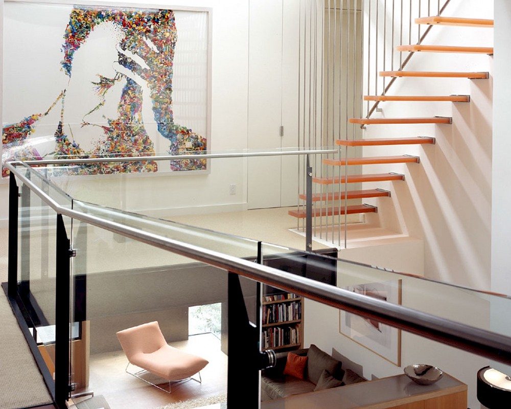
This home is in Noe Valley, a highly desirable and growing neighborhood of San Francisco. As young highly-educated families move into the area, we are remodeling and adding on to the aging homes found there. This project remodeled the entire existing two story house and added a third level, capturing the incredible views toward downtown. The design features integral color stucco, zinc roofing, an International Orange staircase, eco-teak cabinets and concrete counters. A flowing sequence of spaces were choreographed from the entry through to the family room.

This home is a small off-the-grid cabin set against the large rugged landscape of Lake County, north of Napa. The building was designed to work with nature. It was sited to limit the removal of the craggy old Blue Oak trees, while taking advantage of the sweeping views across the mountains of the county. The home follows the natural slope of the site, with the interior stepping up in three small levels and the roof canting at a consistent slope to follow the hill. A massive deck wraps around two sides giving the residents much needed flat surfaces to enjoy spending time outdoors. The exterior is clad in irregular grey vertical siding abstracting the bark of the Blue Oaks, with deep red windows to match the Manzanita trees. The interior features maple paneling, exposed framing and beams and dark stained radiant concrete floors.

The site on a steep cross-slope in Potrero Hill afforded a rare opportunity requiring a rare architectural solution. In a city with so many different kinds of incredible views, this one is a true front-row seat. The entire north side of the building looks out above the neighboring building with a straight-on view of the city skyline. We opted for a reverse floorplan, allowing the family to live their lives with this view every day. Gentle north light suffuses the greatroom with 12’ tall ceilings. We staggered the mullions of the fire-rated glazing to allow the windows to play against the skyline. Huge sliding doors give out to a front terrace and a secret staircase leads up to a roof deck above.

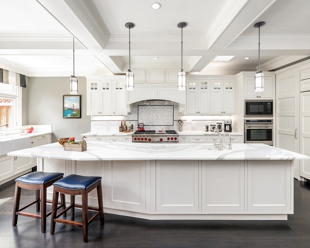
Working from the existing home’s deficits, we designed a bright and classic home well-suited to today’s living. Instead of a dark tunnel-like entry, we have a skylight custom curving stair that no one can believe is not original. Instead of a maze of rooms to reach the gorgeous park-like backyard, we have a clear central axis, allowing a sightline right through from the top of the stairs. Instead of three bedrooms scattered all over the house, we have zoned them to the second floor, each well-proportioned with a true master suite. Painted wood paneling, face-frame cabinets, box-beam beilings and Calacatta counters express the classic grandeur of the home.

Take a client with wonderful colorful taste, midcentury leanings and a nondescript 1940s home in the warm leafy suburb of Burlingame and amazing things are possible. The project adapted and added on to the existing home, coaxing forth its proto-midcentury elements while bringing it into a new century. The master suite appears to float effortlessly above the core of the house. The kitchen is rendered in teak and orange tile, tucked into a ‘sidecar’ volume allowing clerestory windows to bring all day sunshine into the center of the home. Exposed cedar beams add rhythm and interest. Peekaboo windows connect the home with the nearby trees and distant hills.

A new home in the Cole Valley neighberhood, innovately reimagining vernacular forms such as the bay window with new materials and proportions elevates the building, pouring light into the interior. Materials include Health ceramic tile, black steel railings, resin stairs and fir ceilings. Project done in collaboration with Addison Strong Design Studio.

This project is the remaking and reimagining of an historically-rated storybook house in one of San Francisco’s first planned neighborhoods for a 21st century family. Strange half-levels and poor previous remodels were removed. The historic materials and forms of the house were studied and extended while creating a flowing sequence of spaces and a massive new kitchen. White painted cabinets, arched openings and wrought iron railings pull the house together.

An interior build-out of a two-level penthouse unit in a prestigious downtown highrise. The design emphasizes the continuity of space for a loft-like environment. Sliding doors transform the unit into discrete rooms as needed. The material palette reinforces this spatial flow: white concrete floors, touch-latch cabinetry, slip-matched walnut paneling and powder-coated steel counters. Whole-house lighting, audio, video and shade controls are all controllable from an iPhone, Collaboration: Joel Sanders Architect, New York.

CLIENTS
Great architecture comes from the collaboration between the architect and the client. You inspire us and we surprise you. Together, we push the project much further than either of us could alone. We seek your input and ideas and love it when you respect and understand ours. Let’s do this together.
