Public Art Projects

MATERIALITY
Architecture is both space and material, working together. The materiality of the building engages our senses. The feel of a smooth handrail on our hands. The smell of a freshly laid wood floor. The sound of our feet walking across that floor. Since we spend so much of our lives in and around architecture, we believe it is important to care about the physical embodied experience of that architecture. We tend towards authentic and understandable materials; both natural and man-made. We believe in durable materials that will withstand the test of time yet also love the patina that comes with age and use. We appreciate both humble and luxurious materials.

A contemplative space was create at the Asia Society’s Manhattan gallery for the display of ancient and contemporary woven Japanese baskets from the prized Lloyd Cotsen Collection. The play of light/shadow and openness/solidity found in the baskets were echoed in the display architecture. Traditional handcrafted wood carpentry and joinery detailing and contemporary materials such as matt fiberglass were used in conjunction with carefully designed lighting. Collaboration: Professor Marc Treib.

LIGHT
A hallmark of our architecture is light, carefully planned and orchestrated throughout the building. Natural light brings a building to life and shadows tell us about the form and nature of space. Sunlight can be harsh too and needs to be tempered at times. The sun tells us about the passage of time and we consider which rooms want morning or afternoon light. We seek to bring light into the core of the building in surprising and inspiring ways, drawn down through stairwells and double-height spaces.

Produced in collaboration with the artist Eric Staller. Installed in a children's play area in the newly revamped Terminal 2 at SFO, this art piece is deceptively simple. As you walk up, your see static 60's psychedelic circular patterns embedded in the floor and wall. The piece senses your presence and they slowly start to spin. As you step on them, they change through a rainbow of different hues, appearing to turn each other like the gears of a giant absurd machine. Making such a simple thing is anything but simple. Textured 1-inch thick laminated glass covers allow us to walk across them and the entire floor of the airport had to be gently sloped upward to allow the hidden sensors and motors to lie below. Their minimalism is their magic.

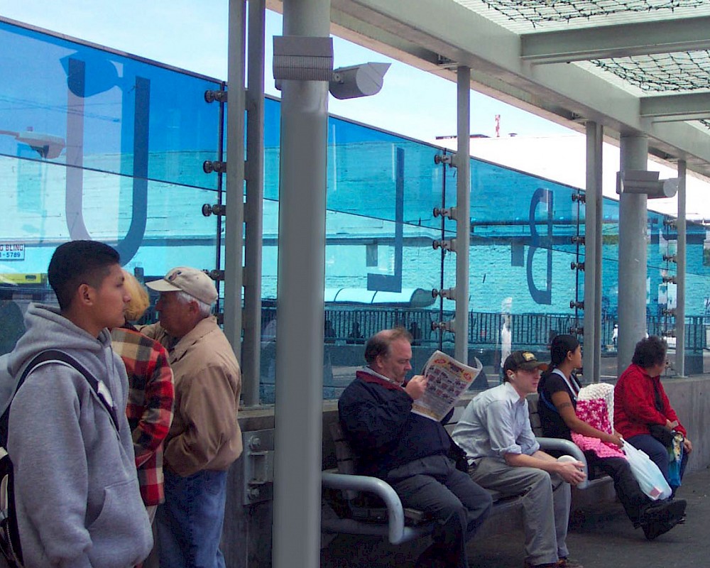
This work takes the “Percent for art” government grant in a new direction, fully integrating the art with the infrastructure. Three shades of blue and text from a commissioned poem are laminated into the glass walls of the bridge where Fillmore Street crosses Geary Blvd. It is a literal/ figurative bridge between the Western Addition and Japan Town and acts as a bus shelter, traffic noise mitigation, and windscreen. It is most beautiful when the low afternoon sun pours through it. Collaboration: Mildred Howard, artist.

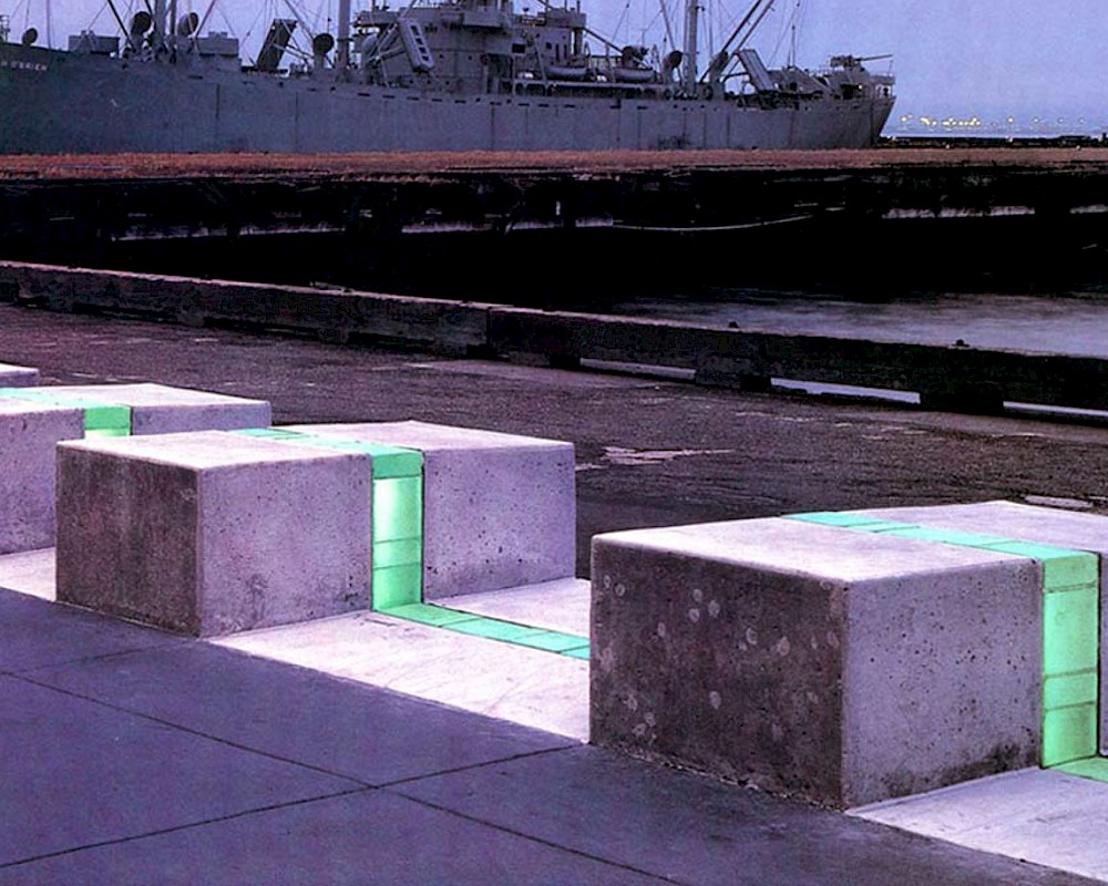
The illuminated glass block and white concrete ribbon runs for 2.5 miles along San Francisco’s waterfront, centered on the refurbished Ferry Building. The project’s concept was to demarcate the actual edge of San Francisco as it reaches its primary seawall and abuts the bay. Beyond the seawall the city stands on piers. The Art Ribbon traces the city’s real edge hidden below. The installation serves as a public amenity, integrating street furniture, sidewalk, and public art. Collaboration: Stanley Saitowitz and Vito Acconci.

We were invited to design a Sukkah for the Jewish Community Center of San Francisco for their annual fall harvest Sukkot festival. This year, they partnered with the urban-planning think-tank SPUR to hold the festival in an alley downtown, turning the Sukkah into an urban happening and intervention. We designed and assisted in the building of the Sukkah. It is a series of wood slats fixed into a steel base, entirely demountable and flat-packed. Each assembly of the Sukkah can be customized by the team putting in together as an expression of community and adaptability. This is an open architecture.

This house of red glass is an installation at Tacoma’s Museum of Glass. It is part of artist Mildred Howard’s series exploring the meaning of dwelling. Here a simple sharecropper’s shack is recast in vivid and luminous color. The theme is the fecundity and beauty of even the most modest house. The house itself is simply constructed. Lapped glass panels rest in custom metal clips. The wood frame is cross-rigged with cables to resist wind and the roof is raised to prevent uplift. Collaboration: Mildred Howard, artist.

PLACE
Architecture is a fundamentally local artform. Every building exists on a site. The site is both literally the ground that is owned as well as the broader context: the street, the hillside, the neighborhood, the climate, the trees and more. This makes architecture a very specific act. A building that is perfect for one site might not work well a mile away. Architecture must respond to the site but also has a way of bringing forth the best qualities of a site, celebrating them and making them more present for the users. When finished, great buildings have a sense of always have been there, just right and intimately connected with the sense of place.

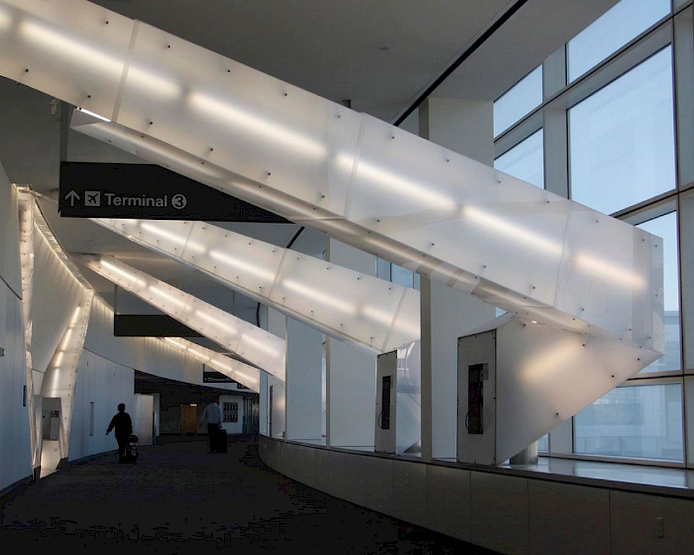
Artists Vito Acconci was commissioned to design an installation for San Francisco Airport’s new International Terminal. His concept was to “freeze” rays of light in mid ricochet as they traveled down a busy passenger corridor. Our firm was selected to help the artist express this vision in built form. The result is a series of steel tubes arrayed with carbon steel standoffs that served both as light mounts and hangers for panels of translucent plexiglass. Collaboration: Vito Acconci. artist.

This house of red glass is an installation at Tacoma’s Museum of Glass. It is part of artist Mildred Howard’s series exploring the meaning of dwelling. Here a simple sharecropper’s shack is recast in vivid and luminous color. The theme is the fecundity and beauty of even the most modest house. The house itself is simply constructed. Lapped glass panels rest in custom metal clips. The wood frame is cross-rigged with cables to resist wind and the roof is raised to prevent uplift. Collaboration: Mildred Howard, artist.

Artists Vito Acconci was commissioned to design an installation for San Francisco Airport’s new International Terminal. His concept was to “freeze” rays of light in mid ricochet as they traveled down a busy passenger corridor. Our firm was selected to help the artist express this vision in built form. The result is a series of steel tubes arrayed with carbon steel standoffs that served both as light mounts and hangers for panels of translucent plexiglass. Collaboration: Vito Acconci. artist.

Constructed in a new public park adjacent to Islais Creek, this massive art pieces calls in the ghosts of the Liberty Ships that once docked here. It is hard to imagine this sleepy creek leading out to the San Francisco Bay as a hub of industry and activity during the World Wars. At over 300' long and 50' tall, this sculpture takes on the scale of architecture. And, like architecture, it serve to make a space: a space for leisure and enjoyment but also for memory and contemplation. The steel beams are double-curved to precisely follow the profile and size of the hull of a Liberty Ship and painted International Orange to stand out against the sky. Collaboration: Nobuho Nagasawa.

THE REGULAR AND THE IRREGULAR
Our architecture often seeks a playful dialogue between the regular and the irregular. What is consistent and what is varied? The restful rhythm of a series of horizontal wood slats contrasted with a varied series of windows, each telling the story of a complex interior arrangement. Life is full of repetition and also full of surprise. We believe architecture should be too.

We were invited to design a Sukkah for the Jewish Community Center of San Francisco for their annual fall harvest Sukkot festival. This year, they partnered with the urban-planning think-tank SPUR to hold the festival in an alley downtown, turning the Sukkah into an urban happening and intervention. We designed and assisted in the building of the Sukkah. It is a series of wood slats fixed into a steel base, entirely demountable and flat-packed. Each assembly of the Sukkah can be customized by the team putting in together as an expression of community and adaptability. This is an open architecture.
